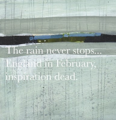
Here is the third sample picture from a multimedia collaboration between myself and celebrated artist, Julian Sutherland-Beatson.
At this stage, we would very much appreciate feedback about which of the three visual interpretation styles people prefer, especially with regard to where Julian has placed the words of the haiku in relation to the picture.
You can find out more about Julian from my two earlier posts this week, and by visiting www.juliansutherlandbeatson.co.uk


My preference is for the one with the handwriting (number 2). I feel pencil marks lend themselves more to the freedom of the paint. The whole thing is cohesive. It has good tones and holds together.
Second favourite is the one where the text is separated from the image on a background of green. It is good but it didn’t make as much of an impact as 2.
My lest favourite is this one. The painting is energetic, the haiku is great. The rain streaks are wonderful and remind me of wet days on school windows. But the font is too corporate for my liking. I might try the haiku, in pencil in the bottom right hand corner? Maybe.
LikeLike
Thanks ever so. That’s really useful feedback 🙂
LikeLike
Nice artwork. I like. I also like the rain of which Tom Robbins, writer, said of our northwest corner of nowhere on the globe (my words): “writing in the rain is romantic.” If you cannot have inspiration, know that you are! Thanks for the share 🙂
LikeLike
Thanks. Glad you liked it. I enjoy walking in the rain, dressed like a mobile tent 🙂
LikeLike